


Seventh Grade - MATH
5: Math
Unit 8: Statistics
Lesson 5
Histograms
Students organize numerical data into histograms, stem-and-leaf plots, and frequency tables and answer questions about which intervals have the highest or lowest frequency (e.g., camper ages, daily temperatures, employee salaries). Students calculate totals and differences of frequencies (e.g., adding histogram bars to find total campers; computing how many more campers are in one interval than another) and identify the most frequent data value in dot-plot/histogram tasks (mode). Students are also asked to distinguish between a sample and a population in quiz items.
Lesson 7
Measures of Variability
Students calculate measures of center (mean, median, mode) and measures of variability (range, interquartile range, mean absolute deviation) on multiple activity pages (e.g., Peter and Elsie book-club data; orchard A vs. B; summer vs. winter births; snakes vs. lizards). Students construct and label box plots from five-number summaries and use box plots to visualize spread and identify outliers (Activity 3 and Interpreting Box Plots). Students compare pairs of data sets and answer interpretive questions that require informal comparative inferences (e.g., which data set shows more variability, which test scores improved, which orchard is more variable), and one activity explicitly states a random sample of 100 homeowners.
Lesson 8
Making Inferences
Students take random samples of word lengths (every 20th and every 15th word), record frequencies, and calculate sample means which they compare to the population mean (about 3.6). Students examine the food-truck sample: they compute measures of center (mean = 25, median = 25, mode = 25) and measures of variability (IQR = 17, MAD = 8.75) and use those measures to make inferences about likely customer spending. The lesson repeatedly emphasizes random sampling, sampling variability, and how increasing sample size tends to decrease variability, and students generate and compare multiple samples in activities.
Lesson 9
Comparing Populations
Students create and compare visual displays (stacked dot plots and box plots) for two populations to assess shape and overlap. Students calculate measures of center (means) and measures of variability (mean absolute deviation and range) for given data sets (pumpkins and zucchinis) and fill in tables showing distances from the mean. Students compute the ratio of the difference between means to the larger mean absolute deviation and use that value to draw informal comparative inferences (e.g., whether fertilizer likely produces larger yields and whether overlap makes that inference uncertain).
Lesson 10
Unit 8 Test
Students calculate measures of center and variability (mean, median, mode, range, interquartile range, and mean absolute deviation) on multiple activity pages (e.g., Opal's and Randall's dot plots, the fiction vs. nonfiction dot plots, bagel sales box plot, and best-seller weeks). Students compute and compare means and mean absolute deviations and then choose an informal comparative inference (Opal vs. Randall inference question and the fiction vs. nonfiction inference question). The Parent Plan Skills explicitly list using measures of center and variability to draw informal comparative inferences about two populations.
Final Project
Statistical Study
Students are instructed to compute measures of center (mean, median, mode) and measures of variability (range, interquartile range, mean absolute deviation) and to create box plots, dot plots, or histograms (Step 4 and presentation requirements). Students are prompted to describe the shape of the distribution, identify outliers, choose which measure best represents the data, and make general inferences about the population and whether the data support their hypothesis (Step 5 prompts). The materials also advise on sampling methods and avoiding bias and recommend an appropriate sample size (10–20 data values) when collecting numerical data.
3: Math
Unit 1: Numbers
Lesson 7
Arctic Marine Research
Students calculate an average daily temperature and the temperature range from given Arctic temperature values (Phase 5). Students compare cell measurements and cell densities between the Arctic sea sponge and Arctic cod by converting values to scientific notation, identifying which is larger, computing how many times larger one cell is than another, and finding differences in cell counts (Phase 1). Students compute and compare population sizes produced by different exponential growth models (2^t vs 3^t) after specified intervals (Phase 3).
Final Project
Mars Station Test Mission
Students calculate and record numerical summaries for each location (heater energy per hour/day/year, solar and wind output per day/year, energy shortfalls, number of fuel cells, and total supply costs) in tables provided in Tasks 1–3. Students compute differences between energy needed and energy produced to find shortfalls and determine quantities (fuel cells, room area) and monetary totals for each site. Students are asked to produce a final presentation that compares the three locations and to include at least three pieces of math-based evidence (e.g., lowest fuel costs, most sunlight, smallest total supply cost) to support a recommendation.
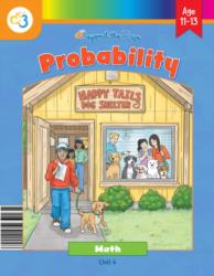
Unit 4: Probability
Lesson 1
What Is Probability?
Students gather numerical data from repeated random trials (coin tosses) and record counts in a table for trials of sizes 5, 10, 50, and 100, converting counts to fractions, decimals, and percents. Students compare experimental probabilities to theoretical probabilities and are asked to observe how results change as the number of tosses increases. In the spinner activity, students compute theoretical probabilities as fractions/decimals/percents based on counts of sections and reason about which outcomes are more or less likely.
Lesson 5
Simulations
Students run repeated random-sample trials (10 or 20 trials) in activities such as Blue Marbles, Music Playlist, What Kind of Visitor, and The Library Hunt and record numeric outcomes (number of pulls/rolls). Students explicitly compute an average in the Music Playlist activity ("add up each of the outcomes and divide by the number of trials (20)") and use the activity pages' TOTAL and AVERAGE fields. Students also compute frequencies/percents (e.g., count how many trials took 4 or more rolls and convert that fraction to a percent) and reflect on how changing probabilities would affect typical outcomes.
Final Project
Happy Tails Dog Shelter
Students run two simulations (small black dogs and large black dogs) using a 10-sided die, record the number of rolls until a success across five trials for each case, and calculate the average number of rolls. Students build a probability model listing percentages for each size/color combination (e.g., 9/60 = 15% for medium white) and use those probabilities to set up the simulations. Students are prompted to compare the two simulations and answer which usually takes more rolls and whether results match the model.
Unit 8: Data
Lesson 1
Statistics Review
Students calculate measures of center (mean, median, mode) and measures of variability (range, IQR, MAD) through guided examples and practice problems. They construct and interpret box plots and five-number summaries (Activities 3–4) and use those plots to compare groups. Activity 5 explicitly asks students to compare two box plots labeled "Class A" and "Class B," decide which class has more consistent scores, and explain differences using IQR and spread. Several problems ask students to compare IQRs and MADs of different data sets and to explain what those differences imply about variability.
Lesson 6
Unit 8 Test
Students compute measures of center and spread throughout the unit (mean, median, mode, range, IQR, and MAD) on multiple data sets (quiz scores, snack prices, heart rates, jumping jacks). Students are given paired box plots (Class A vs. Class B and Class X vs. Class Y) and asked to decide which group has more consistent scores and to explain their reasoning based on the IQR. Several scatterplot and table activities require interpreting medians and distributions when comparing groups or matching scenarios to data patterns.
Unit 9: Semester Exams
Lesson 9
Data Review
Students calculate measures of center (mean, median, mode) and range in Activity 1 and decide which measure (mean or median) best represents a skewed data set with an outlier. In Activity 2, students compute measures of variability (mean absolute deviation, interquartile range), draw and interpret box plots, and compare two classes (Class A vs. Class B) by using MAD to decide which class is more consistent. The worksheets ask students to interpret what the MAD and IQR tell them about spread and to use those measures to compare sets of numerical scores.
Lesson 10
Semester Exam
Students calculate measures of center and spread: Problem 36 asks for mean, median, mode, and range; Problem 40 and 41 ask students to compute and interpret mean absolute deviation (MAD); Problem 42 asks for range and interquartile range (IQR) and to find MAD for a data set. Students draw and interpret graphical summaries: Problem 43 asks students to draw a box plot and Problem 37 asks which measure of center best represents a data set with an outlier. Students make a direct comparison between two groups in Problem 45, where they compare Class A and Class B using mean and MAD to decide which class has more consistent scores.