


Sixth Grade - MATH
5: Math
Unit 3: Ratios and Percentages
Final Project
What's the Best Buy?
Students calculate unit prices for multiple product options and identify the best buy by comparing those unit rates (Activities 2–3). In the extension activity (Question 4 of "Ratios All Around") students are asked to find the average weekly grocery cost for their family and use that average to compute coupon savings. Students also record savings over 1, 6, and 12 months and plot savings on a graph, which requires computing and comparing aggregated values over time.
Unit 8: Statistics
Lesson 6
Measures of Center
Students compare mean, median, and mode for symmetric and skewed distributions using concrete examples (golf practice times, golf tournament scores, movies watched) and compute each measure from graphs and plots. Students identify an outlier (e.g., 83 in golf scores or 25 chickens) and observe how it affects the mean, then reason that the median (or mode) may better represent skewed data. Students answer problems that ask them to choose which measure of center best represents a given data set and justify that choice in context (e.g., golf scores where lower is better, chickens owned).
Lesson 7
Measures of Variability
Students calculate and interpret measures of center (mean, median, mode) and measures of variability (range, interquartile range, mean absolute deviation) in multiple activities and data sets. Students determine the shape of distributions (symmetric or skewed) from dot plots, stem-and-leaf plots, and box plots and identify outliers that affect summaries. Students compare two data sets and answer which has more variability and which individual value is an outlier, and the materials explicitly state that outliers are shown on box plots but are not included in measures of variability. Several tasks ask students to pick a most-typical value for a distribution in context (e.g., which additional household value would be most typical).
Lesson 8
Making Inferences
Students analyze the food-truck data: they identify the histogram as symmetric and calculate mean (25), median (25), mode (25), IQR (17), and MAD (8.75). Students use the IQR to describe a likely spending range (between $17 and $34) and use the mean to project total sales (about $2,500 for 100 customers). Students create inferences for multiple graph types (histogram, stem-and-leaf, box plot) and write or select statements that match the center and variability shown by each graph.
Lesson 9
Comparing Populations
Students identify and describe the shape of data distributions by answering questions that label graphs as symmetric or skewed and by visually assessing overlap. Students calculate measures of center and variability by computing means and mean absolute deviations for multiple data sets (pumpkins, zucchinis) and fill in tables of distances from the mean. Students relate measures to context by computing the difference between means divided by the larger MAD and interpreting the resulting ratio to judge overlap and the practical significance of differences between populations.
Lesson 10
Unit 8 Test
Students calculate measures of center (mean, median, mode) and measures of variability (range, interquartile range, mean absolute deviation) on multiple tasks (bagel sales, luggage weights, neighborhood flags). Students identify distribution shape (symmetric, skewed, uniform) on several items and mark outliers (Randall's test grades, nonfiction outlier). Students compare two populations using measures of center and variability (Opal vs. Randall; fiction vs. nonfiction) and use differences in means relative to MAD to make informal inferences.
Final Project
Statistical Study
Students are instructed to calculate mean, median, mode, range, interquartile range, mean absolute deviation, and to create a box plot (Step 4). In Step 5 students are asked to identify the shape of their data, note any outliers, and answer "Which measure - mean, median, or mode - do you think best represents your data? Why?" and to explain what the variability measures tell them. The project requires students to record the statistical question, attribute, population, methods of data collection, and to include analysis and inferences in their presentation, linking their numeric summaries to the study context.
3: Math
Unit 1: Numbers
Lesson 7
Arctic Marine Research
Students compute the temperature range and the average daily temperature in Phase 5, producing a numeric measure of variability (range) and a measure of center (average). Students also compare cell sizes and cell densities in Phase 1 by determining which organism has larger cells, how many times larger one is than the other, and the difference in cell counts between samples.
Unit 4: Probability
Lesson 5
Simulations
Students run repeated trials in multiple activities (Music Playlist, What Kind of Visitor, The Library Hunt, Blue Marbles) and record outcomes in data tables. Several pages direct students to compute averages (e.g., Music Playlist: "add up each of the outcomes and divide by the number of trials (20)"; Student pages include TOTAL and AVERAGE fields). Students also count frequencies/proportions (Library Hunt: count trials with 4 or more rolls and convert the fraction to a percent) and reflect on variation by answering questions about trials that took a long time.
Unit 8: Data
Lesson 1
Statistics Review
Students compare box plots and answer which class has more consistent scores and explain why (Variability Practice). Activities ask students to identify skewness from box plots and interpret what that skewness and longer whiskers mean (Box It Up). The lesson asks students to interpret MAD in context (e.g., decide whether data are tightly clustered or spread out) and includes a concrete example contrasting two students with the same mean but different variability to motivate using measures of spread.
Lesson 6
Unit 8 Test
Students calculate mean, median, and mode on multiple datasets and compute measures of spread including range, interquartile range (IQR), and mean absolute deviation (MAD) (e.g., Problems 1–4, jumping jacks, and other datasets). Students identify outliers, clusters, and skew in scatterplots and box plots and are asked to compare two box plots and explain which group is more consistent using the IQR. The review checklist explicitly lists that students should be able to "calculate and interpret measures of center... and spread (range, interquartile range, and mean absolute deviation)."
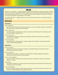
Unit 9: Semester Exams
Lesson 9
Data Review
Students calculate mean, median, mode, and range and are explicitly asked to decide which measure of center (mean or median) best represents a given data set with an outlier (3, 5, 6, 7, 45) and to explain their reasoning. Students compute MAD and IQR, draw box plots from quartiles, and answer a comparison question asking which of two classes with the same mean but different MADs has more consistent scores. Directions repeatedly prompt students to "decide which measure of center best represents a set of data" and to "explain your reasoning," linking calculations to interpretation.
Lesson 10
Semester Exam
Students calculate mean, median, mode, and range (Problem 36) and compute MAD (Problems 39–41). Problem 37 asks which measure of center best represents the data set (5, 6, 7, 8, 40) and requires an explanation (answer key: median best because the outlier skews the mean). Problems 42–44 require students to find range, IQR, MAD, draw a box plot, and explain what the IQR and MAD tell about spread. Problem 45 asks students to compare two classes with the same mean but different MADs and justify which class is more consistent.